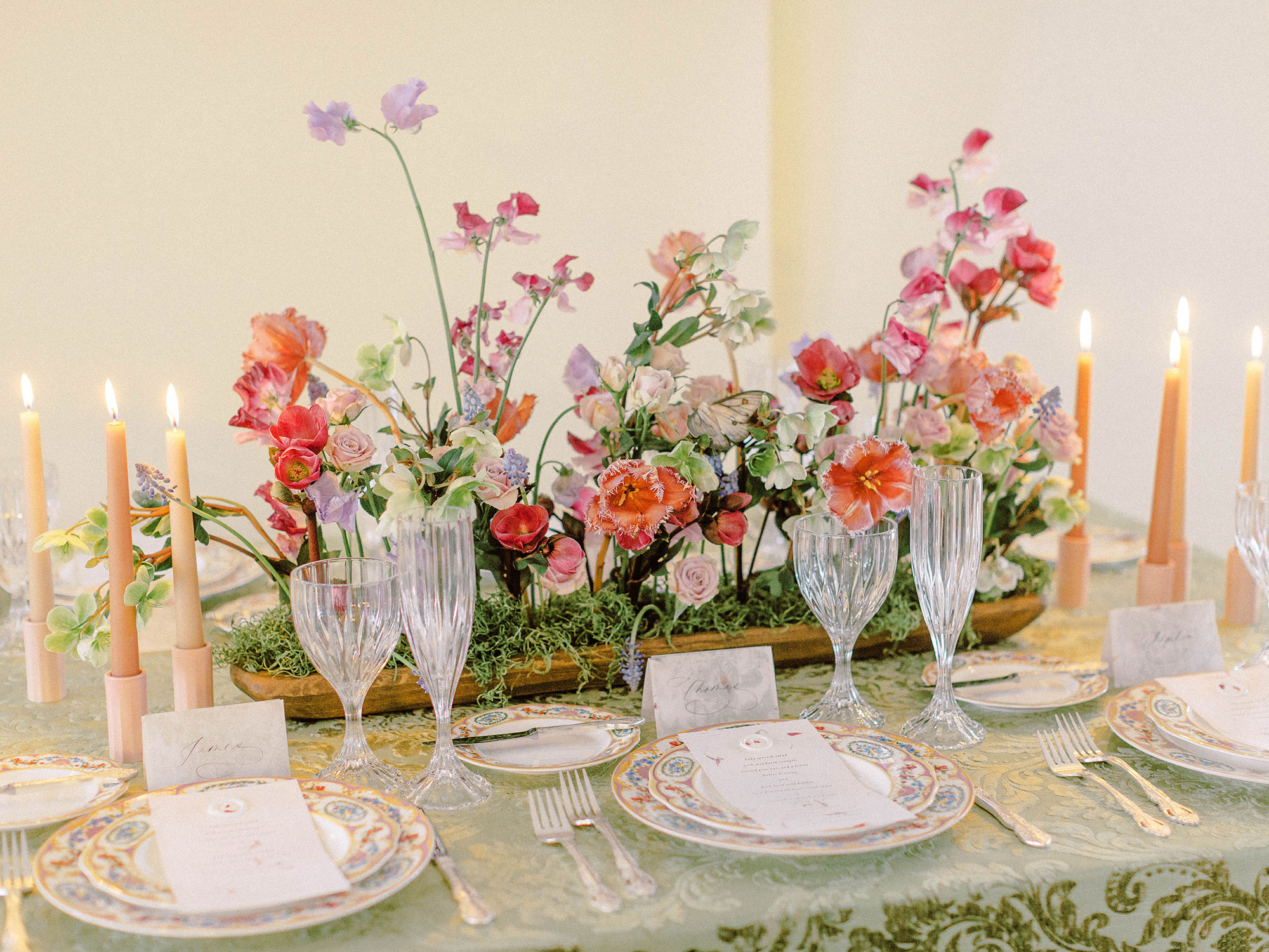

In my decade of wedding planning and floral design, I’ve planned and executed more than 50 creative editorials.
That sounds like a lot of shoots, doesn’t it?
Ten years in though, I still get giddy just thinking about the creative freedom and possibilities when it comes to conceptualizing a new styled shoot direction. Call them whatever you’d like in the wedding industry, a styled shoot or editorial production, is a wonderfully versatile way to showcase your work in a usually controlled environment, work with new or trusted professionals that are otherwise hard to book jobs with, and my favorite, try new approaches to mastering your craft. If you want to learn more about shoots, including my tips and tricks for making them a success, you can sign up for my mailing list and a free guide will be dropped into your inbox.
These days I’m much more selective with the projects I take on. I like to make sure a shoot will have a return on investment of some kind (financial gain, publication potential, hands on work not at the expense of my clients, etc) for it to be worth my time and the money spent to bring the vision to life. As the planner, stylist AND florist on any given shoot, my cost of goods can be pretty significant!
However, this summer, I partnered together with Samantha James Photography to get our creative juices flowing but in a way that didn’t cost a lot of time or money for both of us. While there’s a time and place for involved editorials with many moving pieces, there’s also a time and place for intentionally simple ones and I’d love to share more here with you. I hope this post, and all of the included photos beautifully captured by Samantha from our short summer evening together, will effortlessly highlight just that.
Editorial Production Elements
I love to usually include a visual variety of elements in a styled shoot. This includes, but is not limited to: a couple, personal floral pieces, a stationery suite, and if possible, a tablescape which includes florals, linens, rentals, and applicable auxiliary pieces. If you’re eager to see some of the different types of editorials I have spearheaded check out my favorite past editorials, many which have been published on and in established publications.
From there, ‘bonus’ elements can include a cake or dessert, models beyond the couple like ‘family’ or animals, additional floral installations or vignettes, and sometimes a favor or token item styled appropriately. As you can imagine, all of these things can add up both in the time to organize and execute them, and the cost to make them happen. So for this shoot shared here in this post, we kept things simple but impactful by including the following:
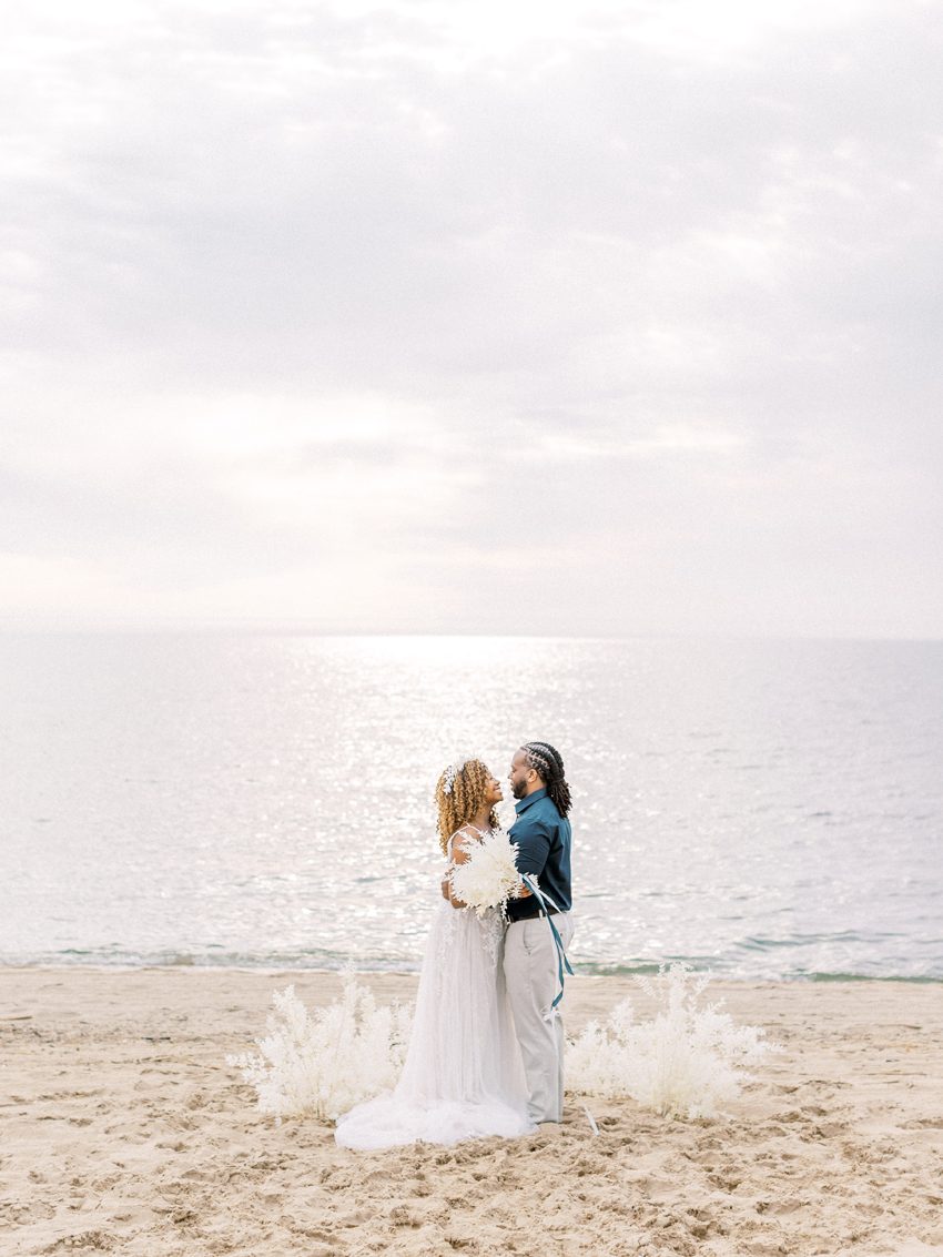
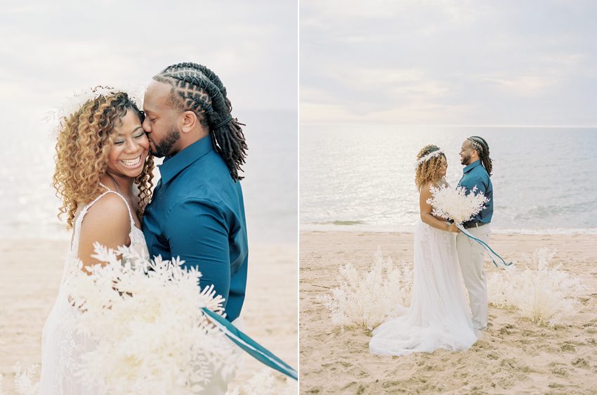
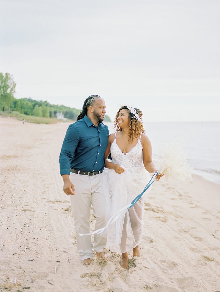
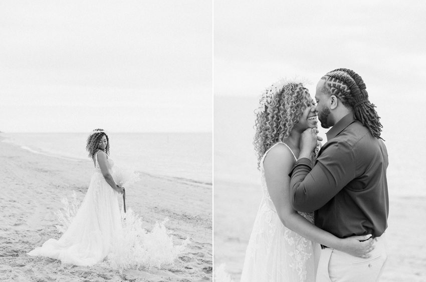
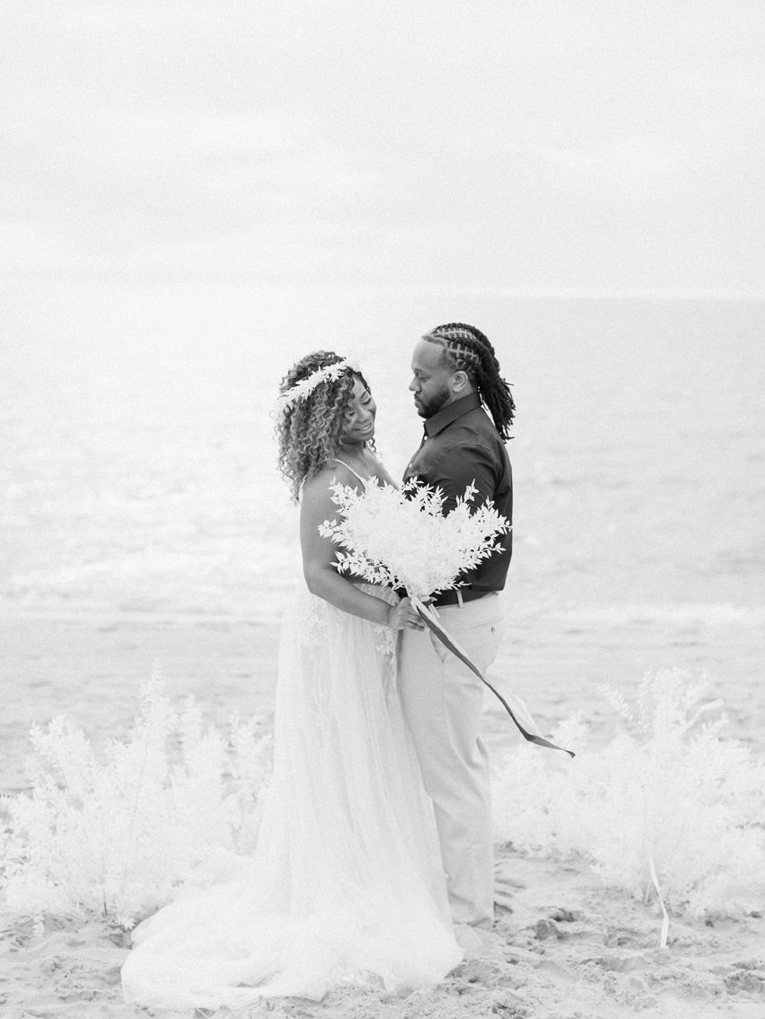
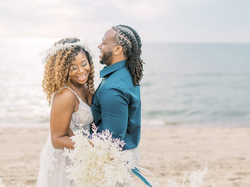
ONE A bride and groom, who as you may have guessed are married in real life! This real time union between our couple not only helped make the shoot feel a little more authentic but the emotion shown in the pictures is the real deal and made Sam’s job a bit easier behind the camera. How sweet are these two?
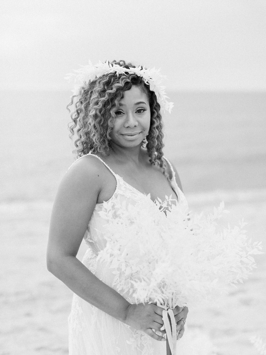
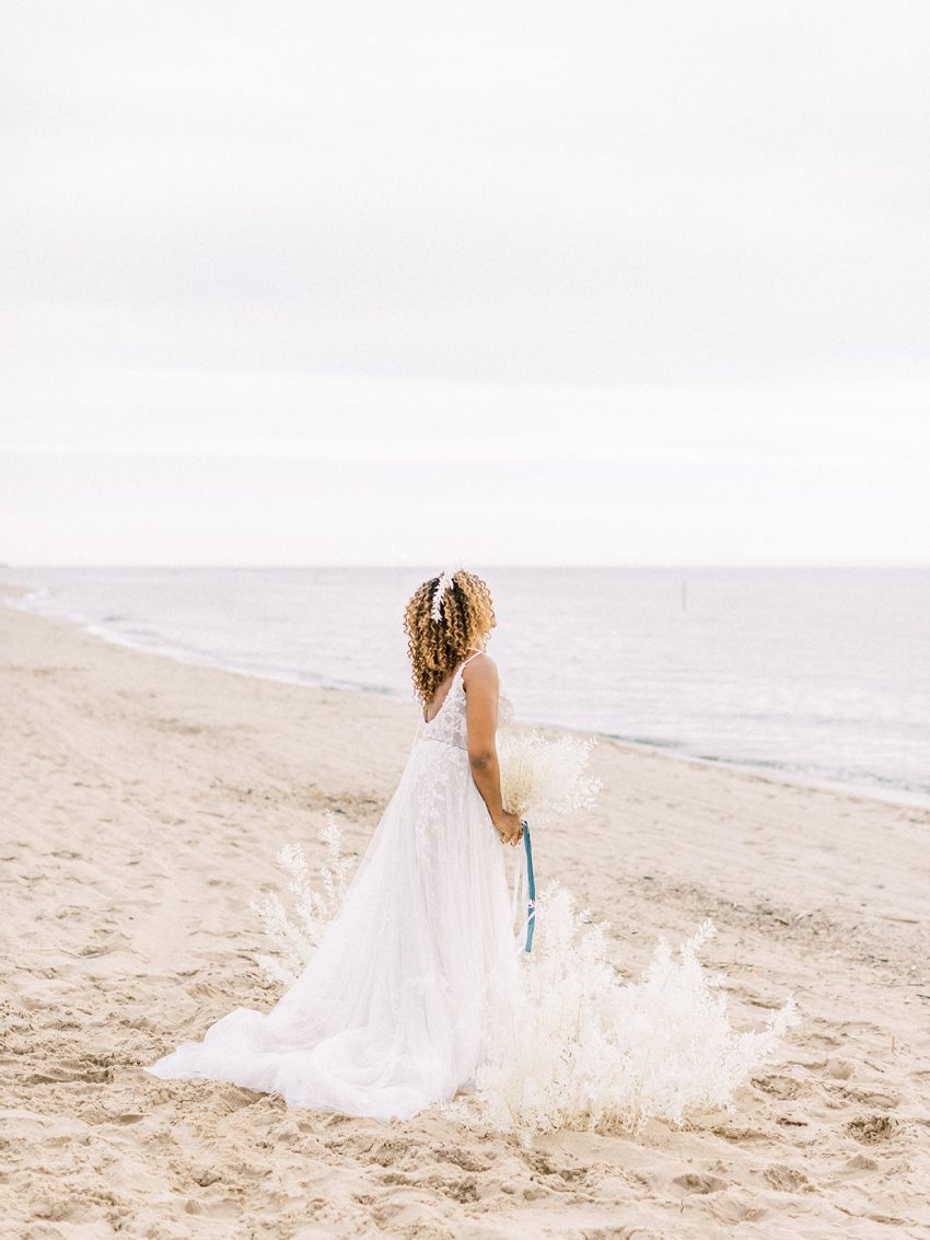
TWO A beautiful formal wedding gown from Renee Austin Wedding. While a gown with this amount of embellishment might not be the right fit for every bride or feel like it’s too formal for the sand and lake environment, we loved how it juxtaposed with the location of our shoot, a secluded Lake Michigan beach. Two contrasting design elements is always one of my favorite approaches to wow-factor designs!
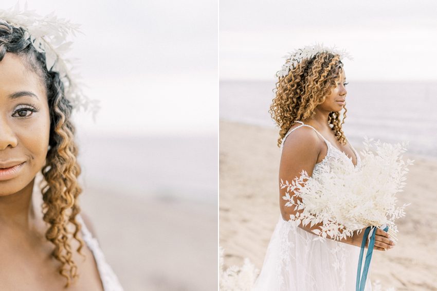
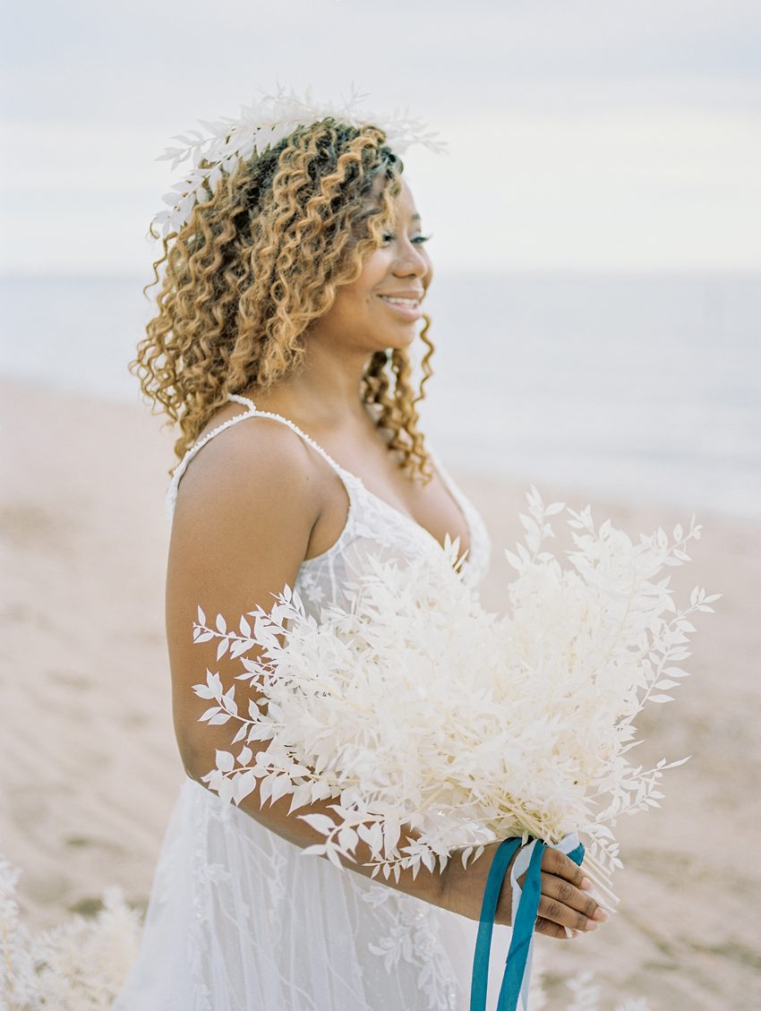
THREE Simple but statement floral elements that didn’t break the bank. Pieces umbrellaed under this category include a bridal bouquet, a small ceremony installation, and dainty crown for our bride to wear. There’s more below specifically on the floral elements, and the cost of this shoot and how that was very intentional.
FOUR I mentioned this above, but a beautiful location that without our couple and other details, was magnificent on its own. Sometimes a venue or a location (like a flower field, historical building, brand new space, etc) can be a standalone detail and lend to the shoot in more ways than just being a space for the project.
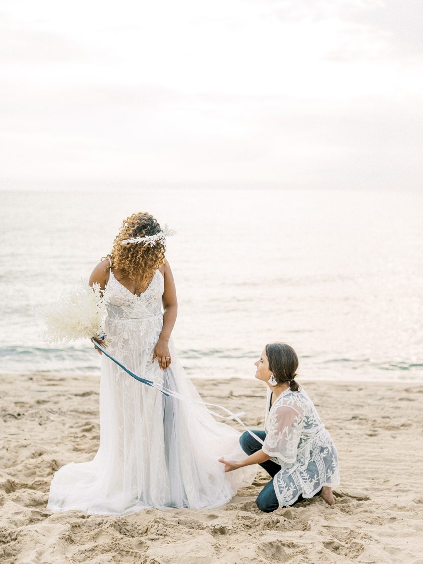
FIVE A ‘bride’ who could style her own hair and make up in a polished way, a groom who was eager to participate, and of course a talented photographer and planner who were able to be present and all hands on deck during shooting. Having such minimal inclusions for this shoot gave both Sam and myself lots of time to style the couple, fix curls, hold up the gown’s train so it didn’t get dirty, make sure ribbons weren’t caught in the bouquet, and converse and joke with our couple, while also ENJOYING our time together making beautiful things.
The Power of Repetition
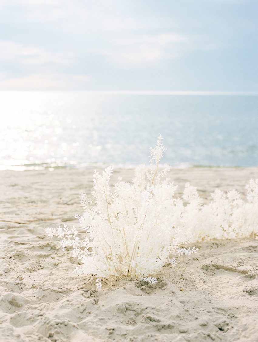
There’s something I like to call The Power of Repetition and I use it often when looking for a way to really make a statement with my designs. This involves using all of one thing, color, shape or style in a design to create a seemingly simple, but impressive, statement aesthetic. In this particular shoot you can tell my repetitive element was the bleached ruscus used in the three floral contributions. The Power of Repetition worked perfectly not only with the floral elements I used but worked parallel to the other simple repetitive elements included in the shoot like our models’ hair styles and the vast beachfront and lake water.
The next time you feel uninspired with a design vision, instead of turning to Pinterest or Instagram think about The Power of Repetition and how one strong solidary design element can be maximized to uniquely exceed expectations.
Try challenging your imagination by working with a monochromatic palette, designing around a shape, or basing your elements around something like a texture. The challenge may feel unnatural at first but most likely will lead to a creatively fulfilling experience that will pay back in big ways for your business and professional relationships.
Cost Effective Simplicity
My goal with this shoot was to spend only a few hundred dollars on the floral, while using product that complimented the beach AND felt substantial. Editorial shoots can cost thousands of dollars when adding up costs like model fees, rentals, floral expenses, rental vehicles, food and wages for staff, film development, beauty services, stationery, location rental, and so on. Editorial productions can truly end up as events of their own!
The idea to used the bleached ruscus came to me the week BEFORE the shoot and while at first it felt too simple and a bit last-minute (which it was in transparency), it ended up both respecting the budget I set while honoring the vision we had collectively settled on. The ribbon on the bouquet was already in my inventory, the gown was on lend from a shop we have a trustworthy relationship with already, our models are friends of Sam and were gracious to spend an hour snuggling with each other for our benefit, and our bride was savvy enough to style her beauty in a way that worked nicely for the occasion while not incurring beauty artist fees.
I mention these things not to paint a cheap light on our efforts but to show that a price tag doesn’t always indicate quality work or a hit end target. Many times you can achieve something beautiful with an intentional approach to being cost effective and this collaborative project shows that in a big bold way.
Styled shoots and editorial productions don’t have to be complicated to impactful or inspiring! Hopefully these photos and my shared approach give you, too the confidence to keep that in mind with your next project. Leave me a note below with your favorite styled shoot tips and tricks, or your questions if you’re a wedding professional. And if this doesn’t apply to you, let me know your favorite elements from the photos!
The smiles on our couples faces are my favorite. Xo