Earlier this spring I spearheaded a small but mighty editorial project alongside my talented photographer friend, Sam. If you’ve been here a minute you all know and love Sam as much as I do! She captures as many professional excursions for me as she does personal milestones, each project always captured more beautifully than the last. What a gem she is in both business and life!
The vision for this editorial shoot was inspired by my love of spring and the muted color tones and delicate nature of the season. Even more appropriate though was the timing of spring this year and the ‘rebirth’ this season seemed to bring after more than 12 months of devastating loss in the wake of the pandemic. The tones and textures incorporated here are meant to be soothing to the eye and inspiring as a whole, much like the first sign of spring in the garden, the first day where the outdoor air finally smells warm, and the first day when the sun lingers a little longer in the sky each evening. Or better yet, I wanted these images to feel like it felt those first few days when we realized just maybe our world was shifting back into a better and more familiar version of life.
Bringing editorial projects to life in the comfort of my home is both a challenge and delight I welcome with much gratitude. The seamless backdrop provides an opportunity for a clean ‘slate’ in which the subjects of the shoot can shine but more so, allows me the chance to get creative with the details but without the distractions and restrictions of my surrounding environment.
Oh! Should we start with the inspiration board I created for the project?
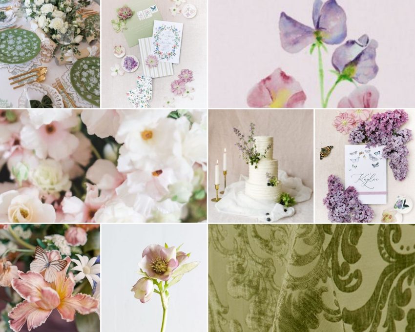
I think most of my projects bring their inspiration board counterparts to life, but this really hit the nail on the head!
My hope is that these images are as inspiring for you as they are for me!
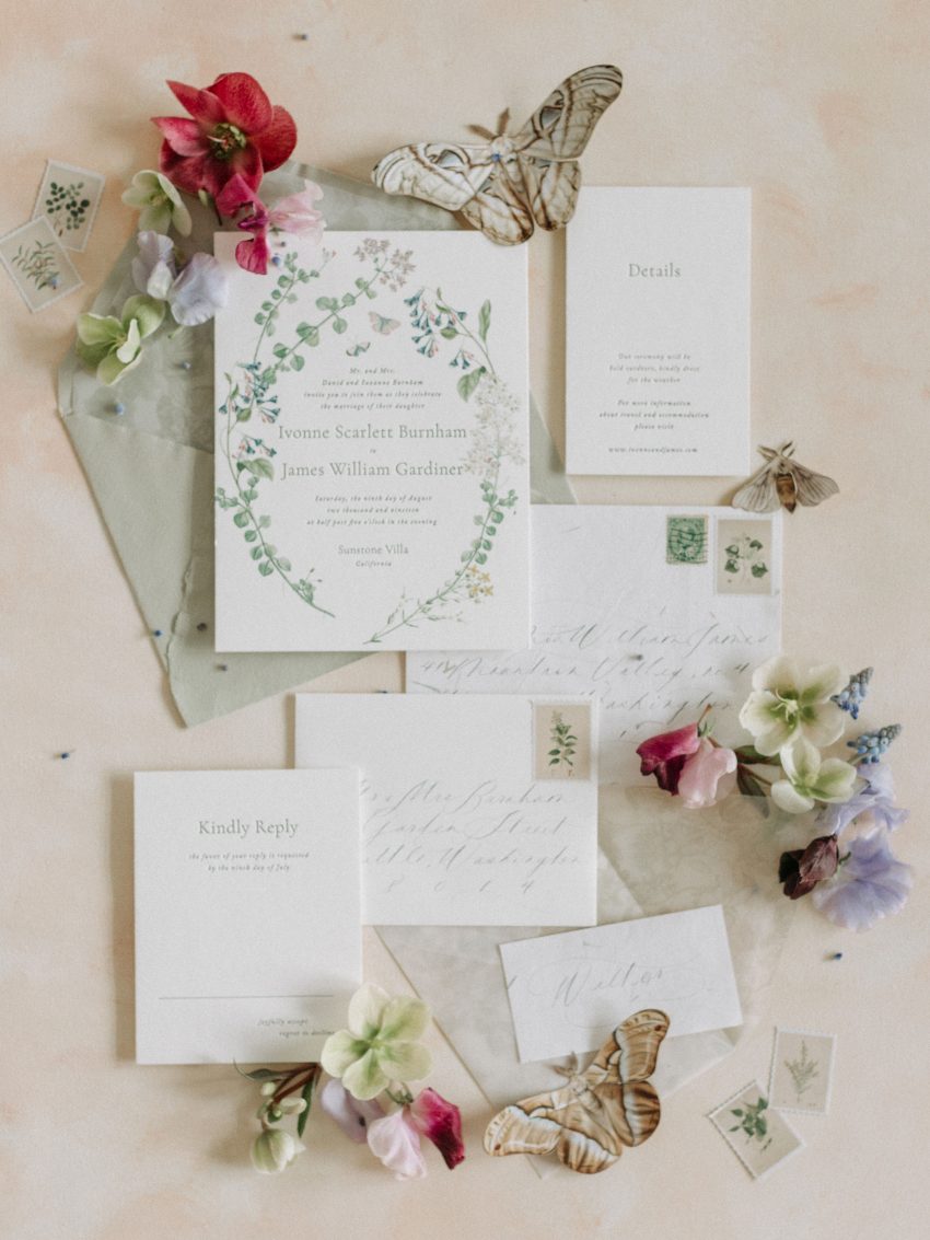
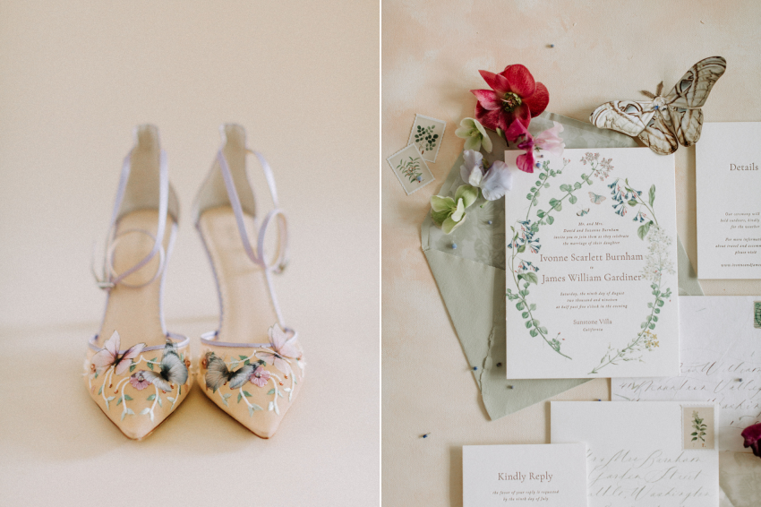
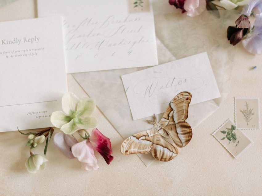
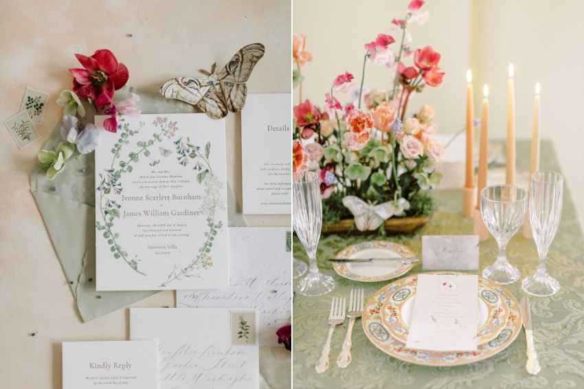
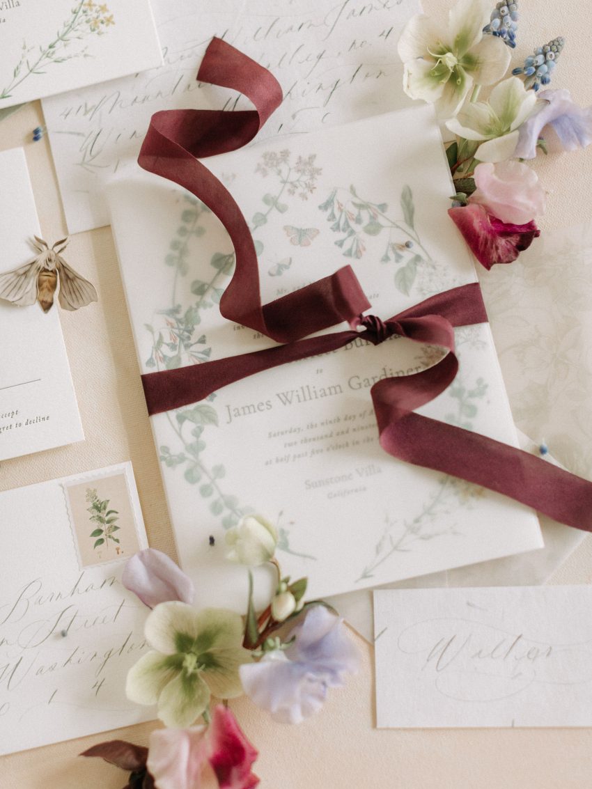
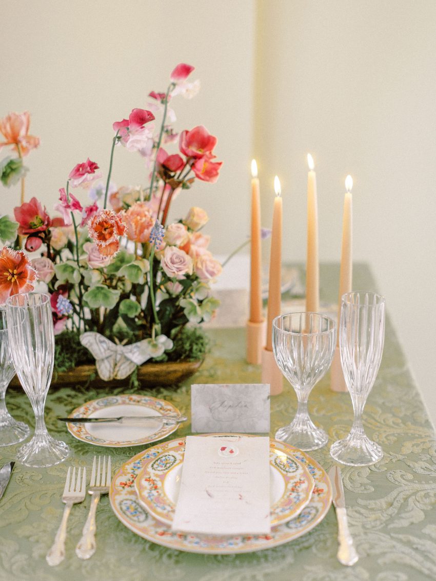
We worked with Aileen from Plume Calligraphy and she brought the delicate spring vision to life in the most beautiful way. The sage green outer envelope, botanical illustrations, subtle damask detailing on the liner which mimicked the velvet linen on the table, the botanical postage stamps; it was all so wonderfully curated and presented. Aside from the gorgeous cohesiveness of the stationery though, we loved how the paper had an elevated casualness that would also apply beautifully to a bridal shower, backyard celebration, or garden party. It’s really a talent to create something so styled yet versatile and Aileen did just that.
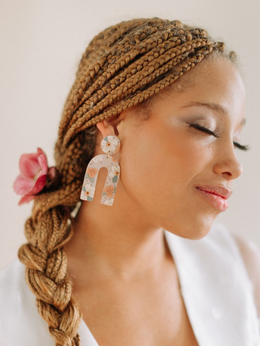
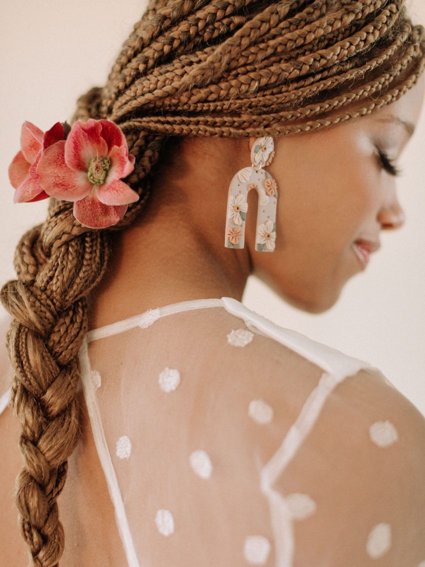
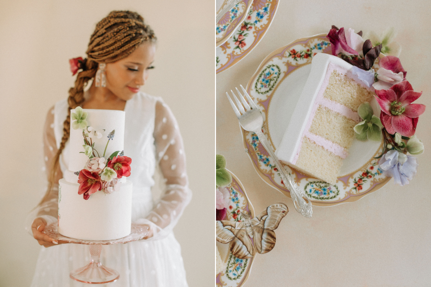
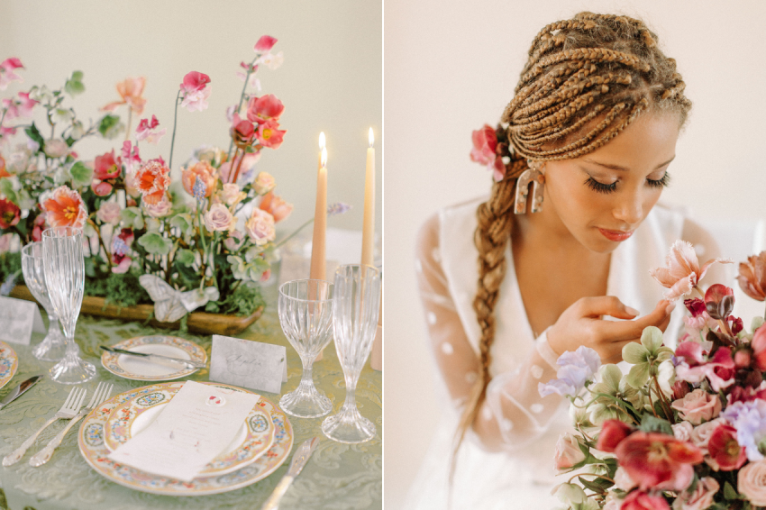
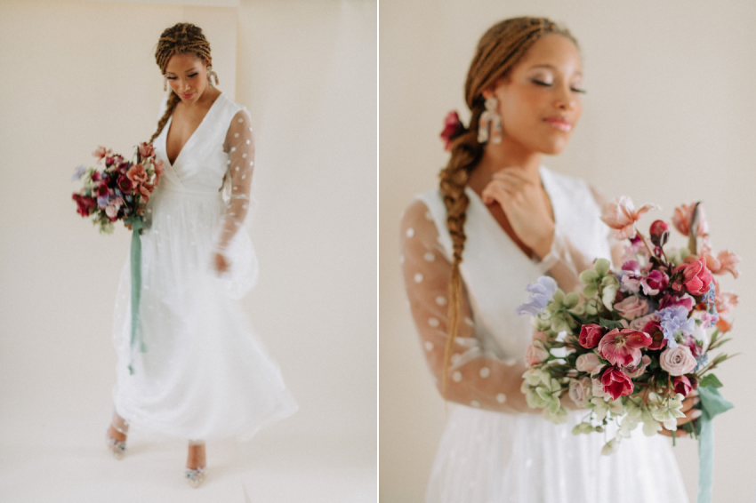
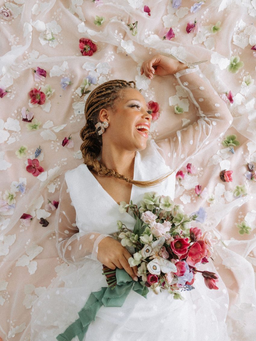
Our beautiful model is donning box braids that she does herself. We loosely pulled all of them back, putting them into a simple, loose fitting braid that rests on the side of her shoulder. We also embellished her hair style with a few of the same flowers used in the centerpiece to compliment the overall shoot aesthetic. Her makeup is a simple look with a natural base coloring to match her skin tone with more emphasis on her eyes where we created a moody and smokey look with an artificial lash on top.
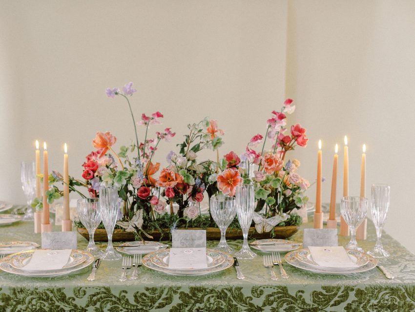
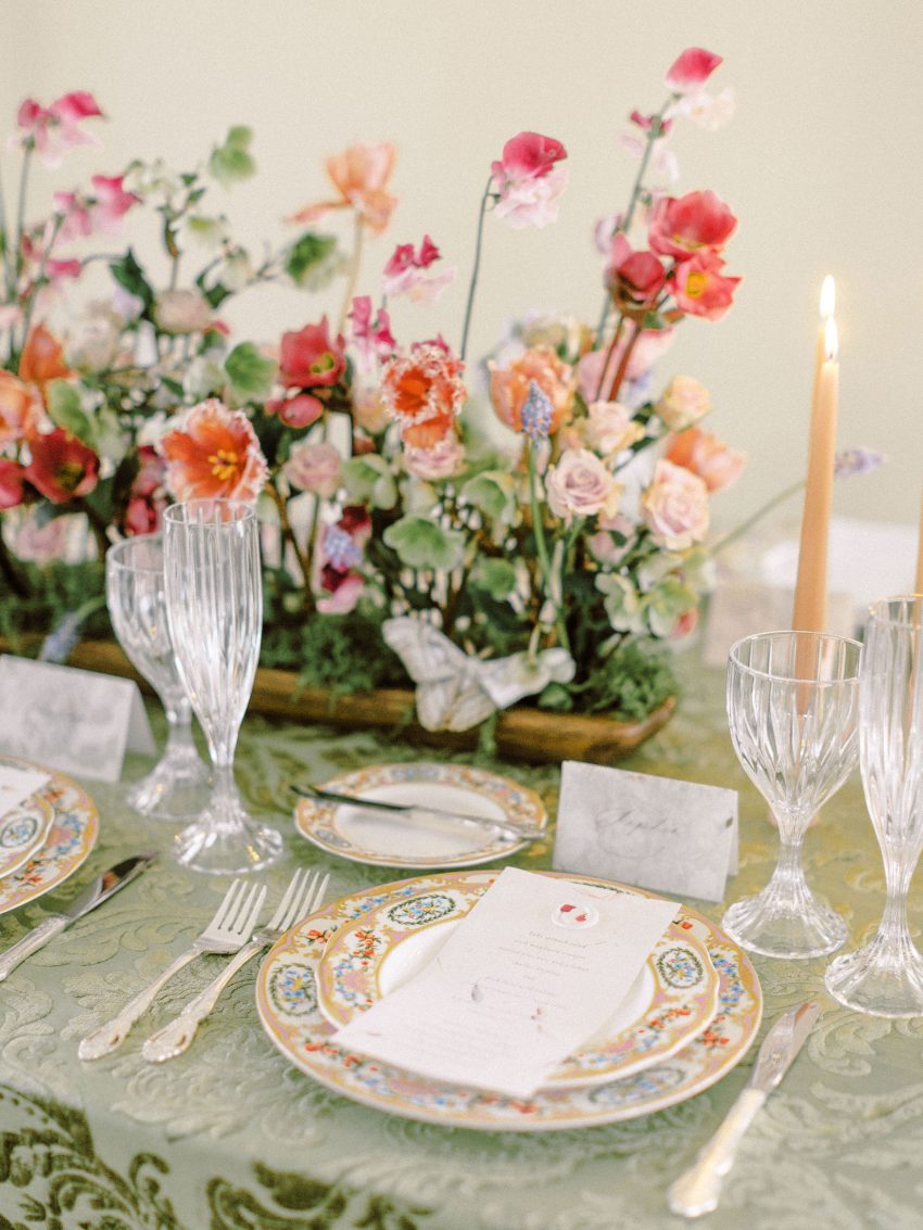
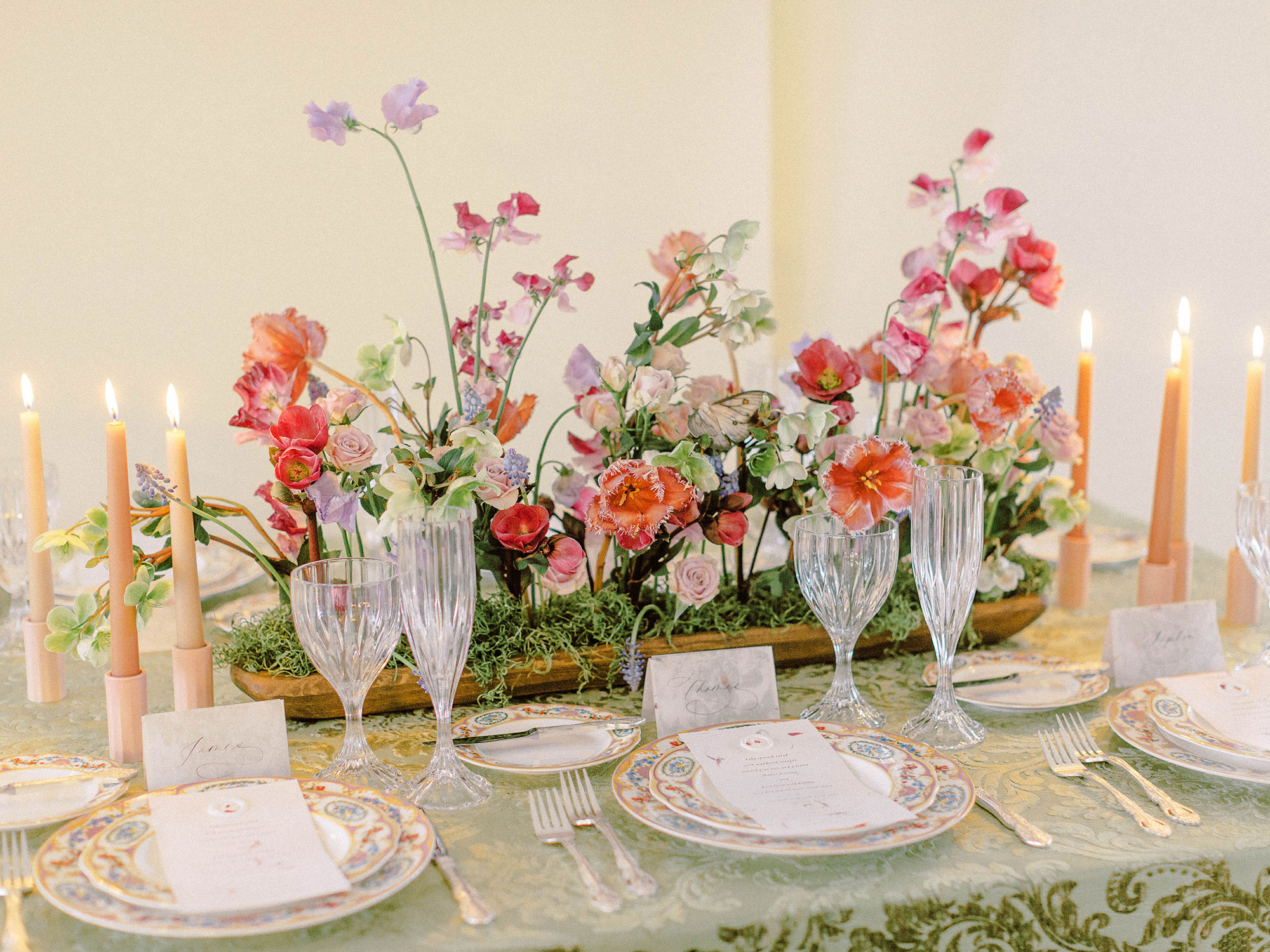
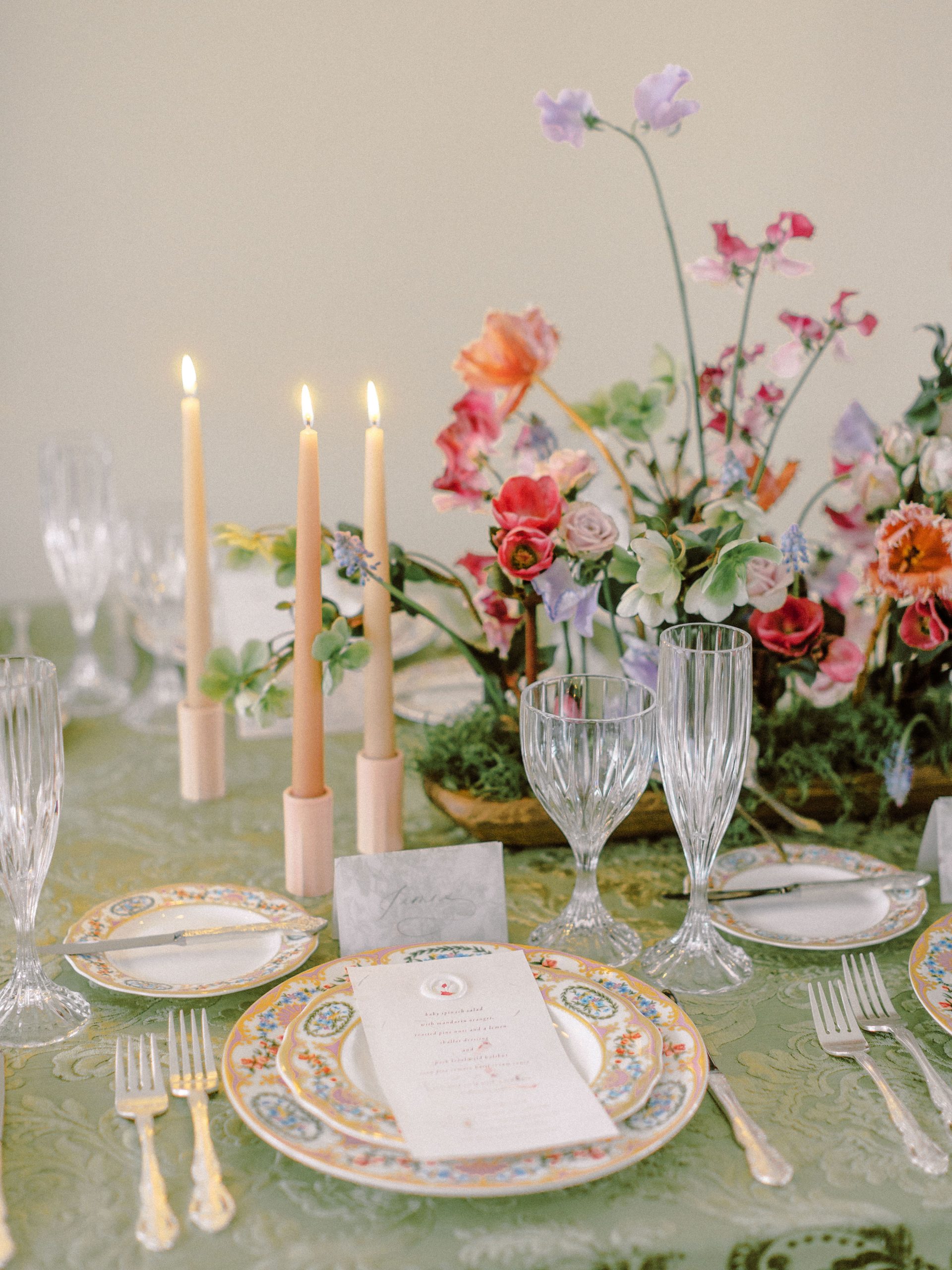
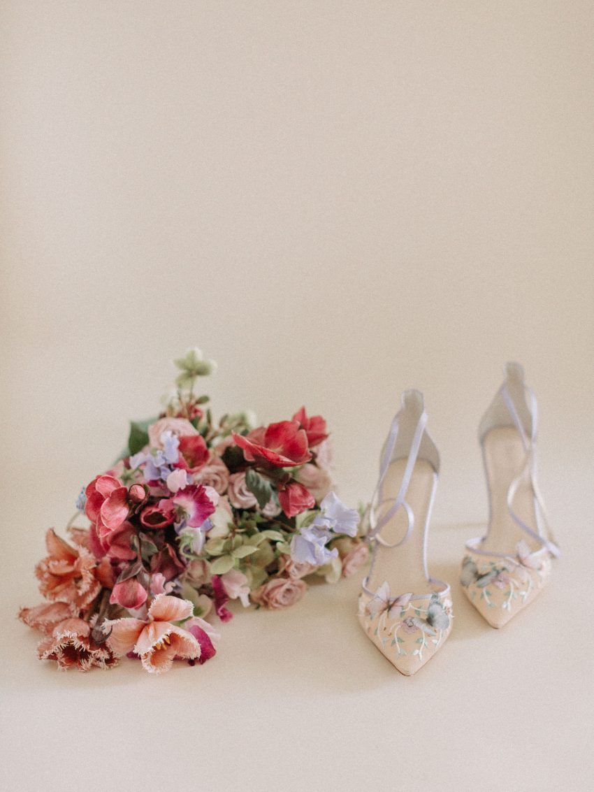
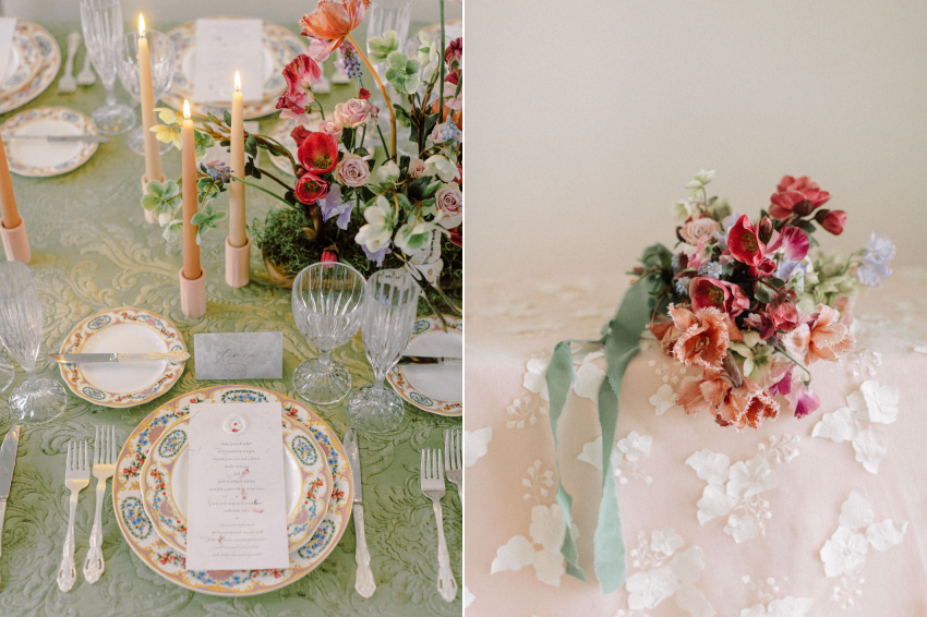
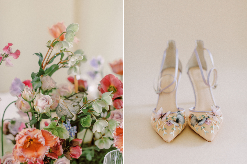
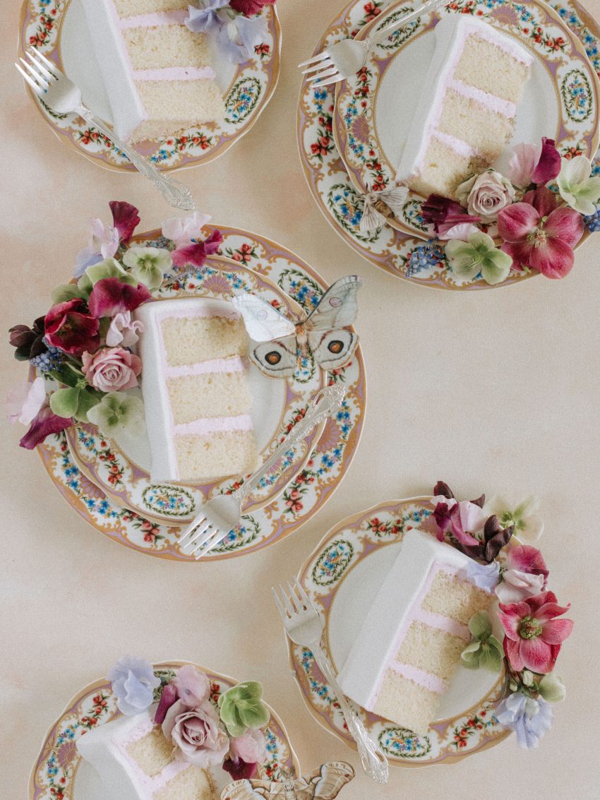
The flowers used in the project are all of spring’s most beautiful delights! Hellebores, sweetpeas, tulips, muscari, and sweetheart roses. To me these flowers are the epitome of spring, their unique textures and tones lending themselves to the softness of the season. To further play off of the season and the somewhat ethereal quality of the project, moss was added to the centerpiece to mimic the design style often seen in now trendy, grand-millennial bulb-style or orchid vase planters. HollyBee and Company provided the beautiful wood dough bowl for me to build the centerpiece in and it worked SO wonderfully with floral frog mechanics.
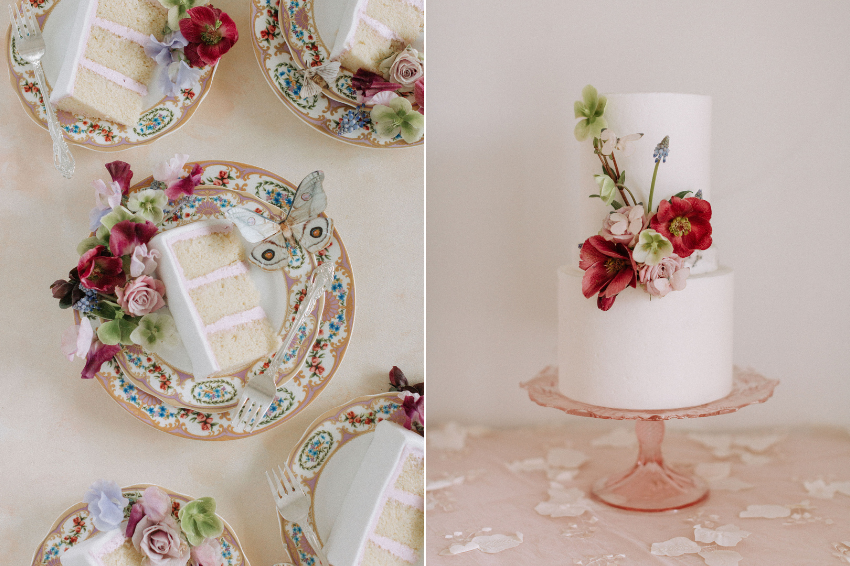
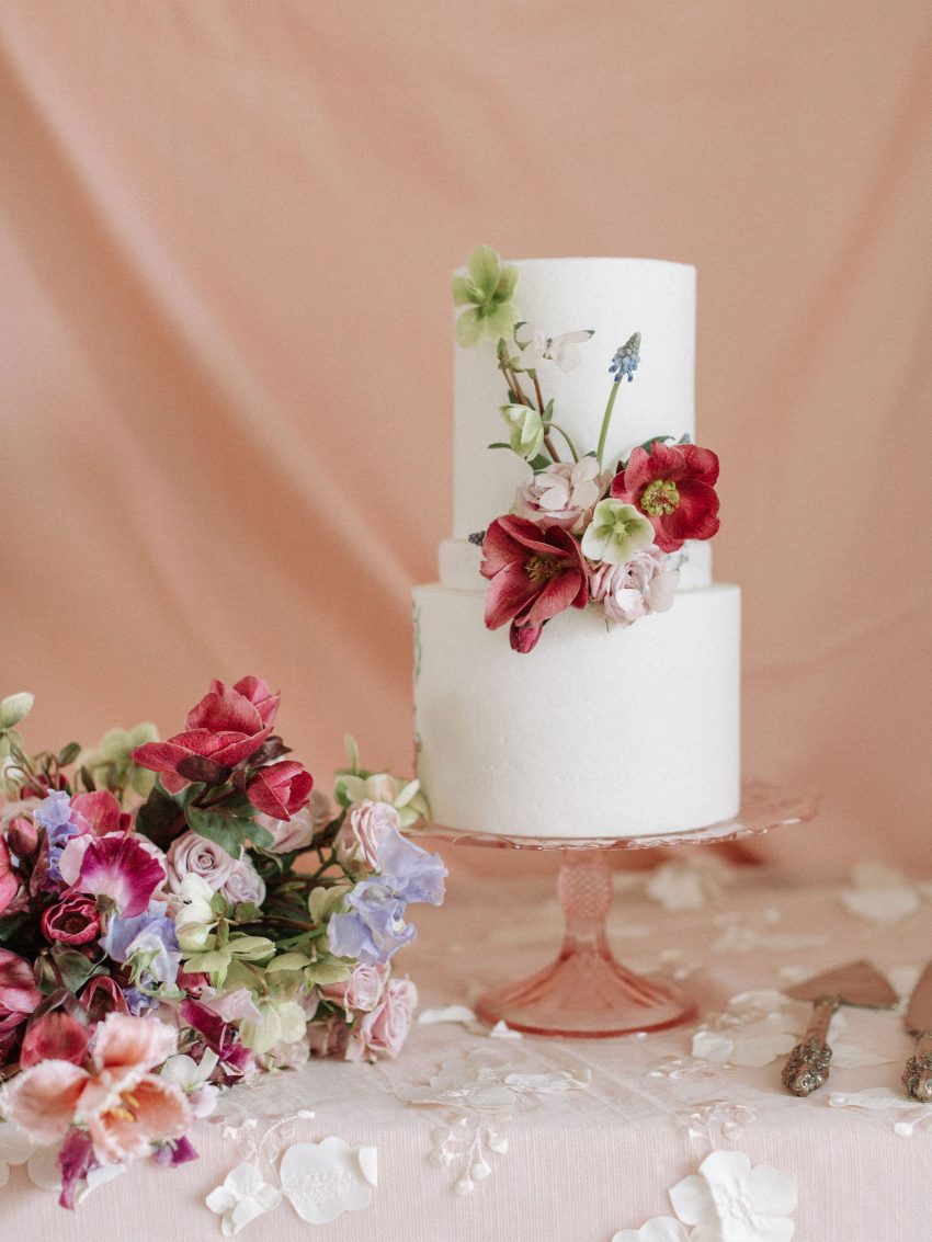
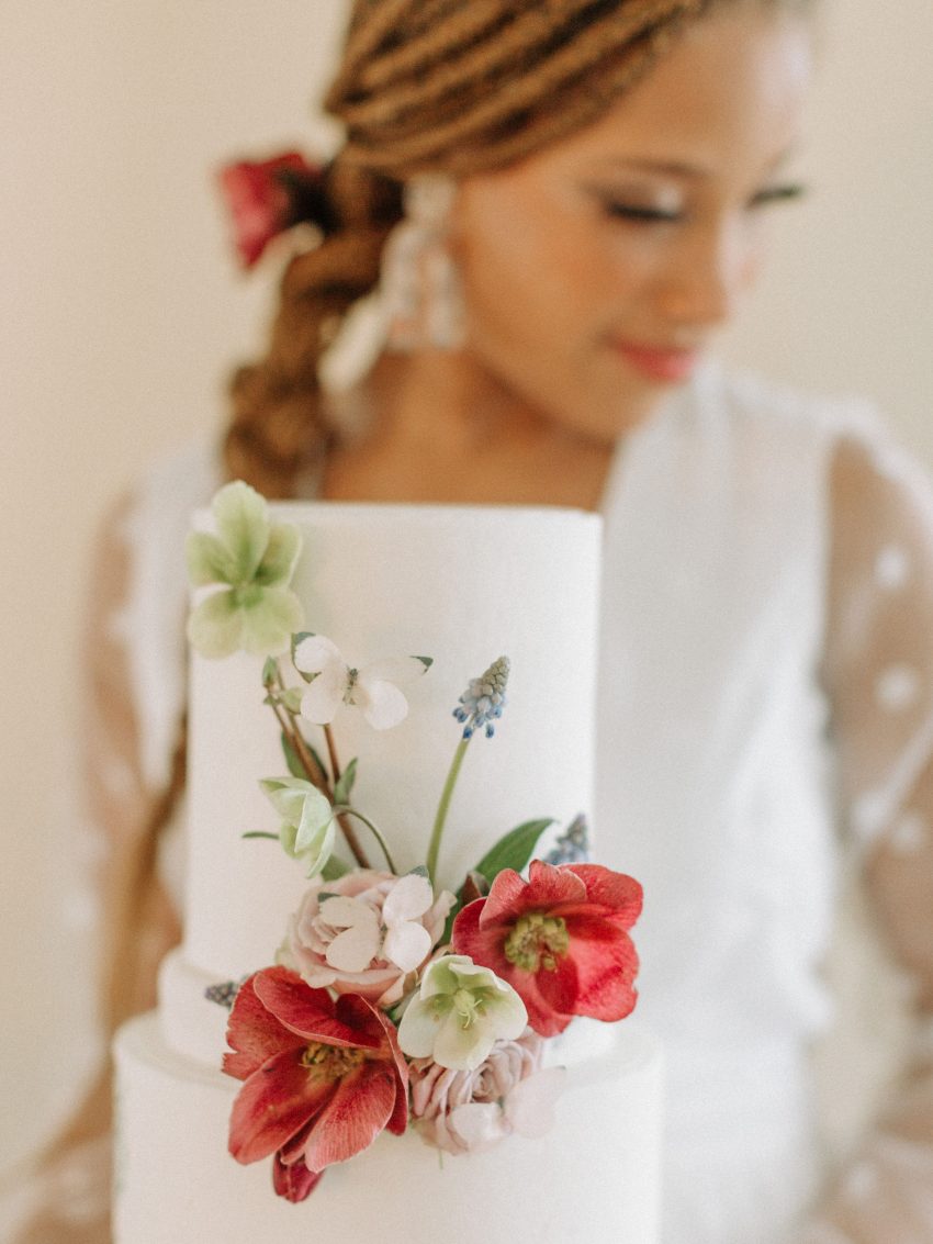
This granite textured ivory cake provided the perfect backdrop to further showcase the stunning flowers curated on the tablescape and in the bridal bouquet. Cake artist L. Alexander of Flour House Cakes & Co. took a whimsical approach with this elegant cake design proving simple is striking. If you look closely you will find delicate edible wafer paper butterflies perched on the vibrant florals. And even more charming? The buttercream in the cake was the perfect shade of pale pink proving the details really make the difference!
The decor rentals were provided by a variety of companies including Event Theory, Special Occasions West, La Tavola Linen, and Holly Bee & Company. I worked closely with all of these companies to select pieces that would layer well on the table and create a special kind of depth to the aesthetic. The texture on the linen, pattern play on the china, colors in the flowers, and detailing on the stationery could have all worked against one another but instead they effortlessly flowed into an inspiring, fresh, and colorful finished product. Could you imagine this tablescape duplicated on a larger scale to accommodate an actual wedding? Wow.

A couple other notable professionals and brands that helped make this project come to life:
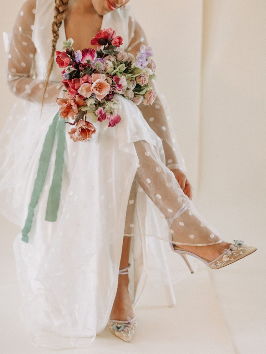
Bella Belle provided those gorgeous closed-toe, purple butterfly heels that were created in collaboration with Joy Proctor. I discovered them the WEEK of our shoot and knew I needed to get them for the occasion! Bella Belle is my go-to suggestion for any special event footwear and these certainly did not disappoint. Look at the impeccable detail in those butterfly appliques. Just wow.
Wedding dress and model selection for an editorial shoot can be challenging when you’re in a pandemic that requires social distancing! Further, because we were firm on having our model be included we knew we would need to find a dress for her, instead a dress first and a model to follow. When I found this gown via Lulus we knew it was the one. The gown’s delicate polkadot tulle overlay matched the airy quality of the project and had a special movement to it that mimicked the daintiness of a butterfly’s flight. We also loved how the full sleeves on the gown yet an open back, made for a complimentary dress style that represents the transition of seasons.
See more of this project on Wedding Day Magazine’s blog, too.
What detail is most striking to you? I’d love to know below! Xo